Wearing Colour and Pattern Without Overdoing It


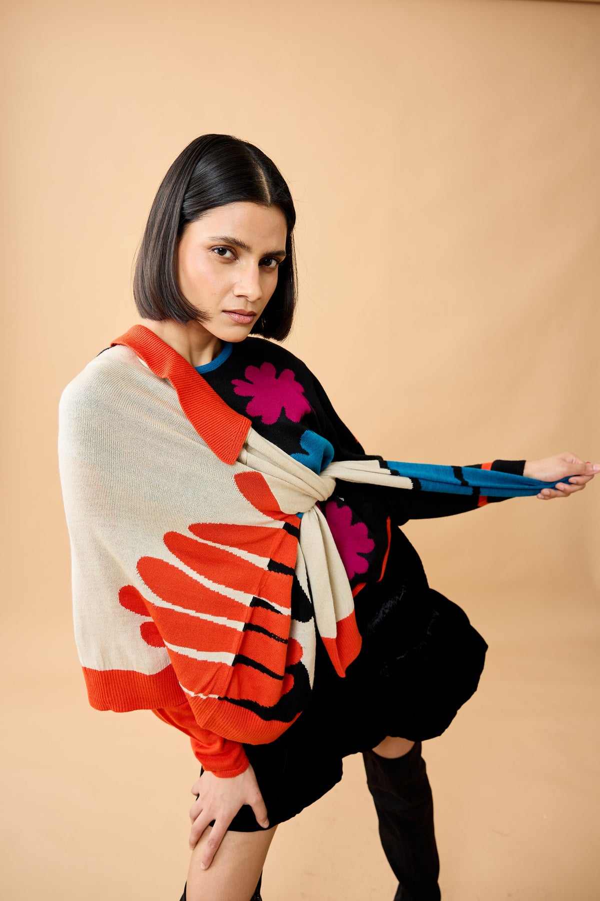
Wear one loud thing and keep everything else quiet. If the knit carries colour and pattern, the trousers, shoes and jewellery should be plain — and picking one colour out of the pattern for a single other item ties the outfit together without matching it.
Most people who say they cannot wear colour have simply worn too much of it at once, or worn it in the wrong proportion. Neither is a fact about the colour or about them.
Here is the whole method, which is simpler than it is usually made to sound.
The one-loud-thing rule
An outfit can carry roughly one focal point before it starts competing with itself. Decide what that is before you get dressed, then let everything else support it.
If the knit is the loud thing — bold colour, jacquard motif, high contrast — then the bottom half is plain, the shoes are unremarkable, the bag is neutral and the jewellery is minimal. That is not playing safe. It is what allows the knit to actually be seen.
Reverse it and the same logic holds: a plain knit lets a printed skirt or a statement necklace do the work.
Pulling a colour, not matching it
The most useful trick in colour dressing, and the most misunderstood.
Take one colour from the pattern — usually a secondary one rather than the dominant — and repeat it once elsewhere. A shoe, a bag, an earring. Not three times, and not an exact match.
Matching precisely looks like a set. Repeating loosely looks considered. The eye registers the connection without it reading as coordination.


Why knitted colour behaves differently from print
A printed pattern sits flat on the surface, so it reads purely as graphic. Knitted colour has the texture of the stitches running through it, which breaks the surface up and softens the effect.
The practical consequence: a jacquard knit in the same colours as a printed top will look less shouty. The stitch texture diffuses the boundaries. This is why bold colourwork is more wearable than people expect, and why it works in settings where an equivalent print would be too much.
Scale changes everything
| Pattern scale | Reads as | Best for |
|---|---|---|
| Very small, repeating | Texture rather than pattern, from a few feet away | Work, formal settings, anywhere you want quiet interest |
| Medium repeat | Clearly patterned but not graphic | Everyday wear, the most versatile scale |
| Large motif or block | A graphic statement | Occasions, weekends, when the knit is the outfit |
| Colour blocking | Architectural, shape-defining | Anywhere, since the blocks follow the body's lines |
If you are unsure about wearing pattern at all, start small-scale. It gives you the interest without the commitment, and from conversational distance it reads as a textured solid.
Combining two patterns, if you must
It can be done, but it needs one of two things to be true.
- Very different scales. A small repeat with a large motif works because the eye can separate them. Two medium patterns fight.
- A shared colour. If both patterns contain the same tone, they read as deliberate rather than accidental.
Ideally both. And keep everything else — shoes, bag, jewellery — completely plain, because the two patterns have used up all the available attention.
Our colourwork is knitted in rather than printed, in GRS certified 60% recycled cotton, 40% recycled acrylic. The recycled acrylic is there specifically to hold saturated colour, because on a jacquard uneven fading does not just dull the piece — it destroys the contrast the design depends on. Plainer styles are knitted in 100% cotton. See the knitwear collection.
Colour in an Indian context
Two things worth saying, because most colour advice is written elsewhere.
Strong light changes colour. Indian daylight is considerably brighter than European. Colours that look rich indoors can read as flat or washed out in direct sun, and pale neutrals can look stark. Saturated tones generally hold up better outdoors here.
The received wisdom about skin tone is mostly nonsense. The old rules about what suits which complexion tend to encode colonial preferences rather than anything about colour. Bright colour against deeper skin tones looks excellent. Wear what you like the look of.
Five practical notes
- Judge it in daylight, not in a changing room under warm bulbs.
- Put colour near the face if you want to be noticed; lower down if you want the piece noticed instead.
- Two colours is a scheme; four is an accident. Three is usually the limit.
- Vertical breaks lengthen. An open cardigan over a bold knit adds two vertical lines and calms the whole thing.
- If you feel self-conscious, it shows. Wear the loud piece around the house first. Confidence in it is most of the effect.
Frequently asked questions
How do you wear bold colour without looking overdressed?
Let one item be the focal point and keep everything else plain, including trousers, shoes, bag and jewellery. Repeating one secondary colour from the pattern in a single other item ties the outfit together without matching it, which reads as considered rather than coordinated.
Can you mix two patterns?
Yes, if the scales are clearly different or the patterns share a colour, and ideally both. A small repeat with a large motif works because the eye separates them, whereas two medium-scale patterns compete. Keep accessories completely plain when combining patterns.
Is knitted pattern less bold than printed pattern?
Generally yes. Printed pattern sits flat on the surface and reads purely as graphic, while knitted colour carries the texture of the stitches, which breaks up the surface and softens the boundaries. The same colours often look more wearable knitted than printed.
What pattern scale is best for work?
A small repeating pattern, which reads as texture rather than pattern from a few feet away. It provides visual interest without becoming a graphic statement. Large motifs and colour blocking suit occasions and weekends better.
Does skin tone determine which colours suit you?
Far less than commonly claimed. Much of the traditional advice on this encodes cultural preference rather than anything about colour itself. Saturated colour looks excellent against deeper skin tones. Lighting matters more in practice, since strong daylight changes how a colour reads.
How many colours should an outfit have?
Two reads as a deliberate scheme and three is usually the workable limit. Beyond that an outfit tends to look accidental rather than composed. A patterned piece counts as more than one colour on its own.
The short version
One loud thing. Pull a colour once, don't match it. Small scale for work, large for occasions. Judge it in daylight. And most colour rules are less true than they sound.
More on how knitted colourwork is made, layering, or dressing for occasions.
Read more
Getting Your Knitwear Ready for Winter
Most people discover the state of their knitwear on the first genuinely cold day — the worst moment to find a hole. An hour in late October saves the scramble.
Read more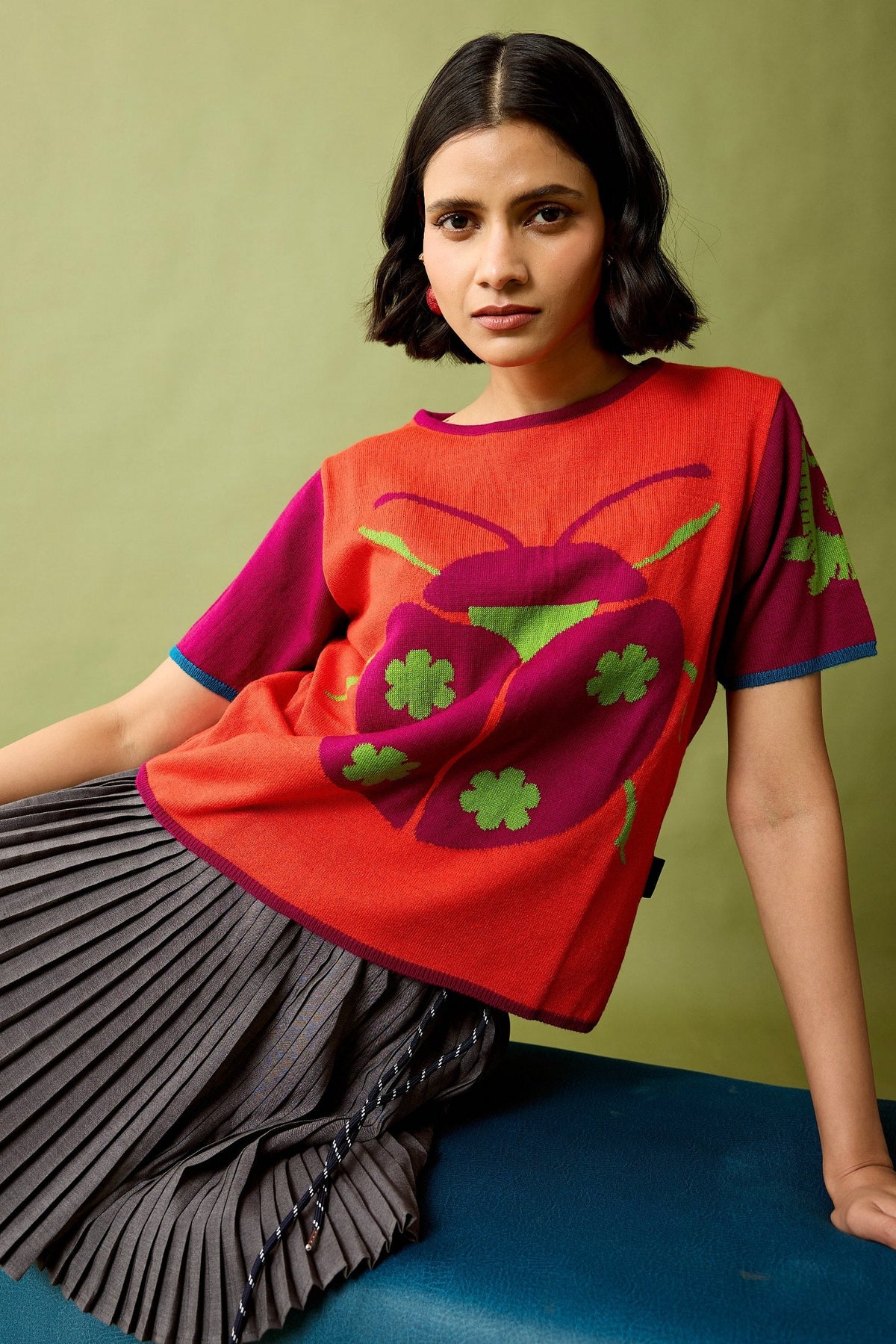
Half Sleeve vs Full Sleeve Knits: Which to Buy
Advice written for Europe gets this backwards for India. Which to buy first by city and temperature band — and why a fine-gauge full sleeve beats a chunky half sleeve in heat.
Read more

